Library file page-organization strategies (pros and cons)
Published:
July 28, 2025
Updated:
Apr 18, 2026
Read time:
3
minutes
minute
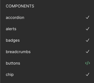
All components on one page
This is my favorite method, albeit unpopular. Here's the pros and cons:
Pros
Complete control over how consumers experience asset panel.
More accurate sense of the "weight" of your published assets (by using the resource panel)
Makes putting any responsibility of project management into Page names impossible. Remember, edits to the page name mean you're editing the main components on that page. If you're having components mysteriously show up as "modified" in the asset panel, it could be because you're putting "status" emojis or the initials of whoever is assigned to work on those components in the Page name. I've got an entire other post about this if you want to read more.
Cons
Can be dangerous if your assets aren't memory-efficient. You'll want to address that first before considering switching to this organization schema.
If you have more than ~24 components, it can take a while to find things by panning around the canvas. You'll want to get good at relying on <span class="inline-code">command</span> + <span class="inline-code">F</span> or jumping to main components using the asset panel.
Because all components are together on one made, an errant <span class="inline-code">command</span> + <span class=inline-code">A</span> can cause you to edit everything by mistake. That being said, undo-ing is easy.
Increases the risk of conflicts when multiple branches are open. This can be mitigated by being rigorous about the scope of work happening in any given branch (keep it focused), as well as planning and communicating well with your team.
One component per page
This is what most teams do. Typically I see them organize their pages alphabetically. I believe this method favors library maintainers at the expense of library consumers.
One component per page
If the team is displaying text styles, color styles, or variables on the canvas, those items tend to get named and grouped seperately from the component-pages
Pros
It can feel easier to navigate, especially for people who are in the library every day.
Each component is given a huge amount of breathing room. This makes the experience of building and editing components feel focused and safe. All the other components are safely tucked away on their respective pages and can't be mistakenly edited.
Cons
Eventually a component will be built that might belong on the same page as another. As ever, buttons are a great example. Should the button component with just a regular label and the icon-only button go on the same page? Or do you have a page called "button" and another page called "icon button"? If you go with the latter, do you make an exception to the alphabetized order of page names? All of these questions, to me, show how fragile this method of organizing is.
The temptation to add status emojis to page names is very strong. This is dangerous. Not only is that information bound to go stale and conflict with other project management tools, but every time it changes from 🟢 to 🟡, that counts as a "modification" to the components within.
Alphabetized page names must be organized manually (or with a plugin like Reorder Pages)
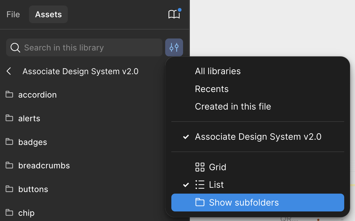
For consumers using the "List" view or those who have "Show subfolders" turned on, they will often dig into asset panel folders that only contain a single component. This can slow consumers down, and making navigating the asset panel frustrating.
View options of FIgma's asset panel
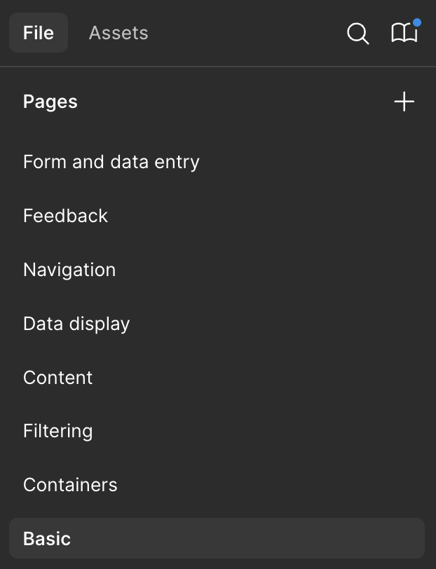
Themes
I've heard of teams doing this, but haven't seen it in practice.
Figma pages named after themes
Pros
This system can reinforce a system's "when to use" guidance for its assets. For example, hyperlinks might be placed on the "navigation" page. This can help remind designers that links shouldn't be used to take a user somewhere, not submit information (like a button would do).
Cons
You will eventually run into the issue of "this component fits within 2 themes...", and it'll likely be your inputs (checkboxes, radios, selects, etc).
Initially you might put them on the "Form and data entry" page, but then you'll also want them to live on the "Filtering" page. Good news! Filters are forms. Consider having the individual inputs on the "Form and data entry" page, and then compose common filtering set-ups on the "Filtering" page.
The same thing might happen with a hyperlink component. It's feels like it'd be at home on a page named "Basic" element, but also "Navigation"
Navigating out this issue is a great one to pair with your favorite developer on.
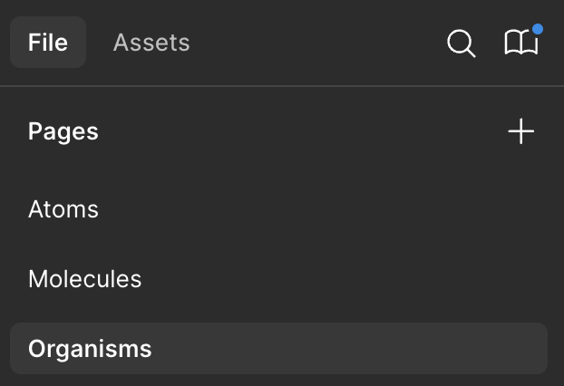
Components by atomic scale
The "Con" of organizing components by theme leads us to this organizing schema.
Again, think about how an input component might start on the "Form and data entry" page, but then instances of it are used to compose common filters on the "Filtering" page.
That smells like atomic design! So you could just... lean into that. Call an atom an atom, a molecule a molecule.
Figma pages named after steps in the atomic scale
Pros
Similar to "components by theme", this method lets you reinforce the system's opinion. But instead of that opinion being about usage, it's about relative size.
Cons
Unless you're building a library for yourself to use, you're going to encounter someone who disagrees with, or is confused by how certain components are categorized.
<h2 id="change-log">Change log</h2>
Current version Added a new "con" to my favorite method regarding branch conflicts.
July 28, 2025 First publication.
Interested in more?
If you'd like to be notified of when I publish a new blog post, joining my newsletter is a great way to keep up. My readers enjoy bonus behind-the-scenes insights on every post!
Thanks for signing up! 🥳
Check your inbox for an email about confirming your subscription ✅
Shoot, I'm sorry. Something went wrong while processing your submission. Not your fault, the problem is on my end. In the mean time you can send me an email or DM me on twitter and I'll get you sorted out.
I use my own natural, human intelligence to ideate, write, and edit my blog and newsletter.
Component Tune-up Service
Stop wasting time wrestling with auto layout, variables, and variants. Let me handle that so you can focus on making the mockups and prototypes your stakeholders are waiting for.
Get the 12-point checklist to evaluate your own components right inside of Figma! Modify the list and add your own criteria to suit yours and your team's needs.
Thanks for signing up! 🥳
Check your inbox for an email about confirming your subscription ✅
Shoot, I'm sorry. Something went wrong while processing your submission. Not your fault, the problem is on my end. In the mean time you can send me an email or DM me on twitter and I'll get you sorted out.
When you subscribe you'll get notified when I publish new blog posts. My newsletter is 100% spam free. Nothing but respect for your inbox 💪 and you can unsubscribe any time.