Many teams source their icons from an existing collection.
It's an easy choice when there are so many excellent, free icon libraries out there! Phosphor, Lucide, FontAwesome, and Untitled, to name a few popular ones.
When a design system is starting up, or entering a new generation, a Figma librarian will often have to import all those SVGs and prepare them for usage. Most of the time this means turning each icon glyph into a component.
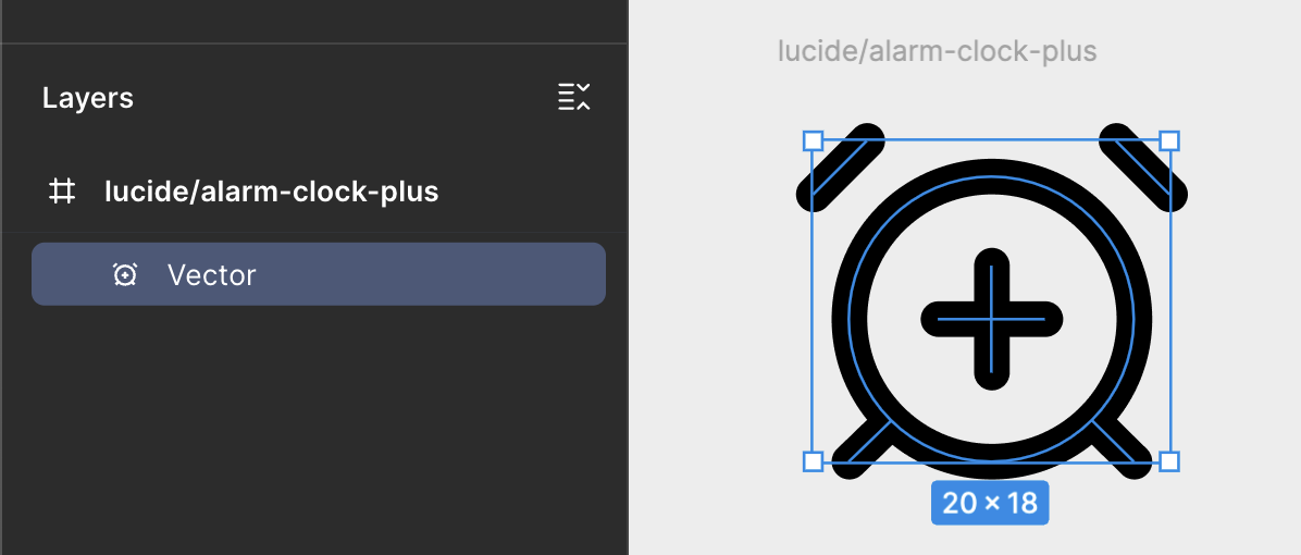
Some libraries, like Lucide, import SVGs where each path is separated out as individual layers:

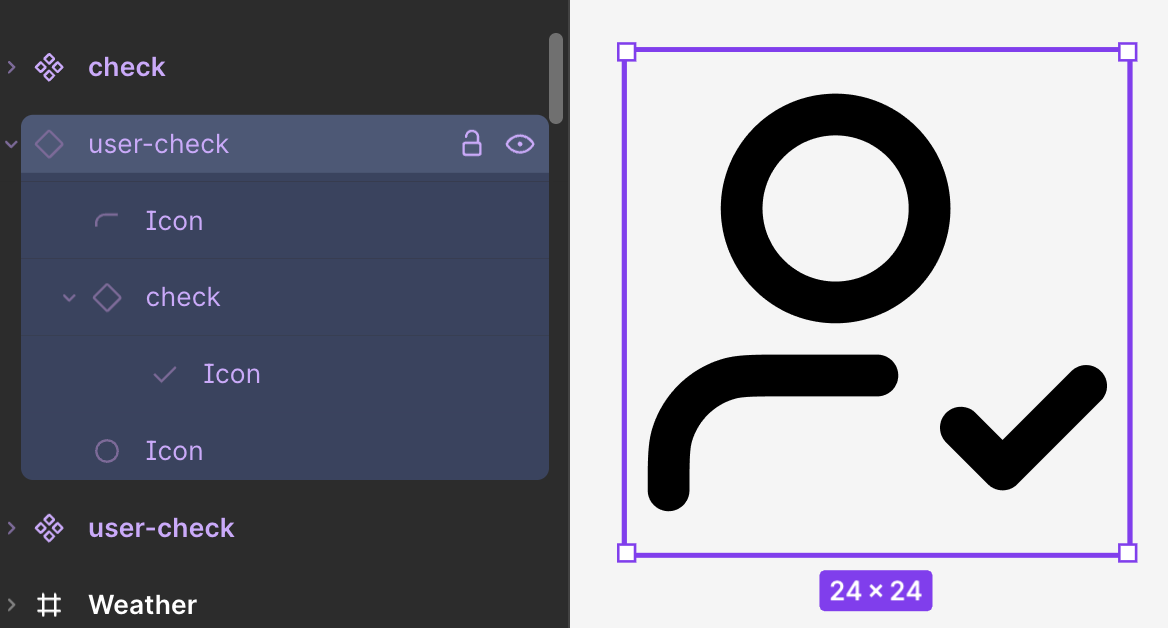
Most design system designers' first instinct will be to flatten those layers.
They do this because they want to make sure consumers color overrides are preserved if they choose to swap between icons. Flattening those layers turns results in a single-layer SVG path, like this:
But whether they realize it or not, flattening those layers has closed the door on a lot of opportunities. Yes, it was in favor of a better consumer experience (override preservation), and that's good, but we shouldn't pretend it's free from other negative consequences:
This matters less for existing icons, but can matter a great deal when the team needs to make custom icons.
Few teams have an in-house icon illustrator they can lean on to do that work. More often the responsibility falls to a product designer who has dabbled in illustration or icon-making.
That designer will be much more successful making custom icons if they can grab individual SVG paths from other glyphs.
Similar to the first point, re-used shapes like plus-signs (+), minus-signs (-), checkmarks (✔️), exclamation points (!), and sparkles (✨) that are reused across glyphs cannot be componentized, like so:
If a future re-brand or refresh to a products' visual identity calls for icons that use more than one color, a single flattened SVG path won't be able to support that. For now, Figma Design only lets you apply 1 stroke color to a layer. So 1 layer means you only get 1 color.
The same goes for stroke widths. Now, this might not come up for in-product icon usage, but it's a much more likely possibility for brand and marketing teams whose icons benefit from more complex visuals. If your design system team has aspirations to expand your influence into the world of marketing design, you'll have new consumer-needs (like fancier styling) to account for.
Flattening discrete layers into a single layer means you can't animate different parts of an icon. Not long after I first published this blog post, MDS put out a video describing how critical micro-animations like this can be as a differentiator for brand and marketing.
All those problems I described above don't have to come at the cost of losing overrides. You can protect overrides and keep your SVG paths separated. To do so, you simply need to use shape building tools.
To prove the override protection, check out this this GIF:
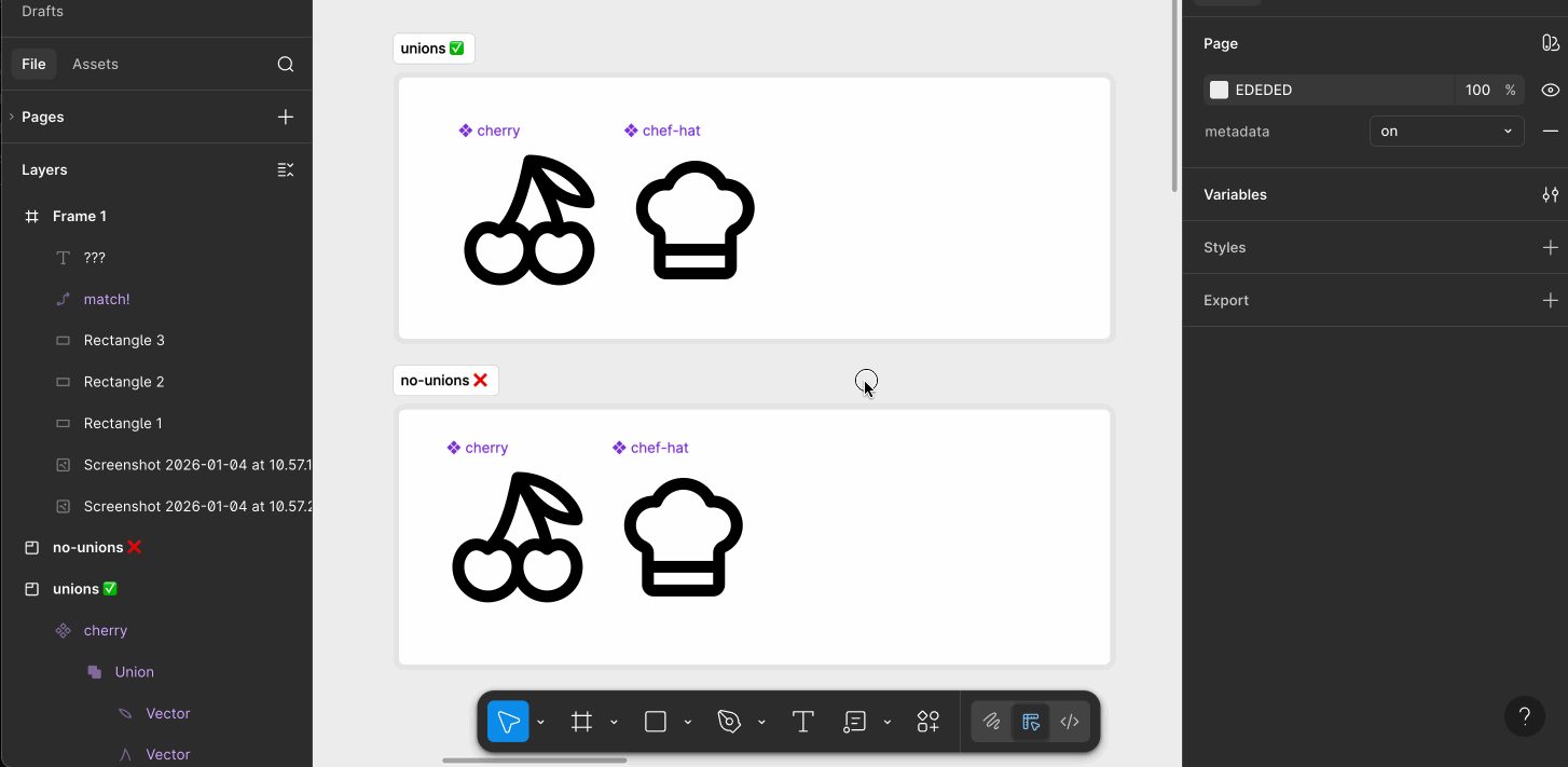
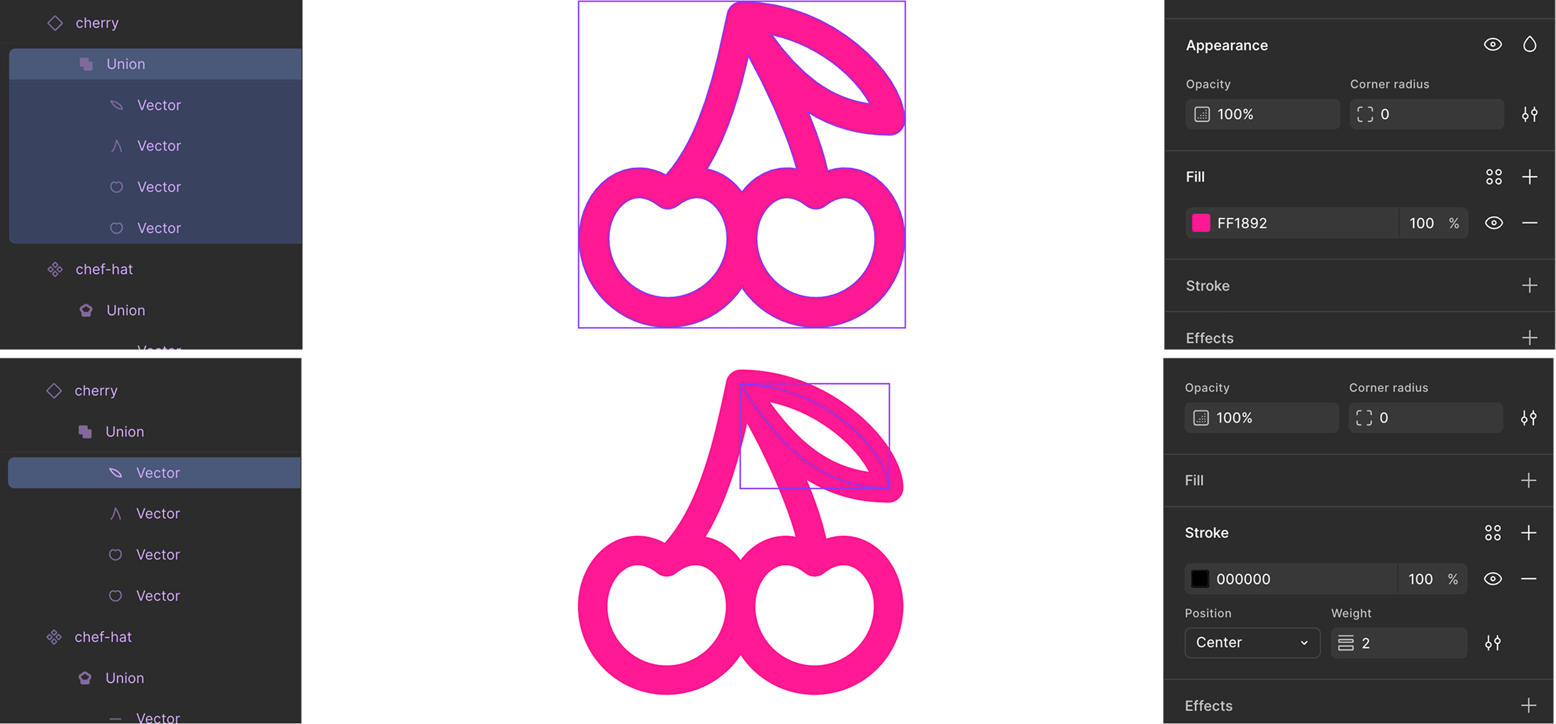
The section on the bottom—not using shape-building—didn't preserve the pink color override on all the paths because Figma is looking for matching layer names. And Figma does not care how many layers there are.
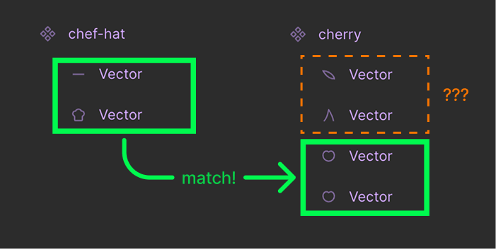
<span class="figma-component">chef-hat</span> has 2 layers, both named vector. <span class="figma-component">cherry</span> has 4 layers, all named vector. Figma recognized the first 2 layers within <span class="figma-component">cherry</span> —the fruit body shapes—as matching the first two layers of <span class="figma-component">chef-hat</span>, so it preserved the red override. But it didn't have anything to match to the other 2 layers of <span class="figma-component">cherry</span> (the stem and leaf) so those remained black.
If the swap happened in the opposite direction (<span class="fimga-component">cherry</span> to <span class="fimga-component">chef-hat</span>) then things would've been fine.
This partial color override issue only occurs when you swap an icon with fewer layers for one with more layers.
That's where shape-building layers come in.
Figma doesn't care how many child layers are inside of a union or subtraction. It just cares that those layers have names.
And the reason we have to use shape-building layers and not extra frames is because the shape-building layer is what is responsible for holding the color. Its children can have any color applied to them, and it won't matter. The color of the shape-building layer wins out. And that's how color overrides get preserved.
This is a powerful concept to understand. You can extrapolate it to achieve much more complex systems within your Figma icon collection.
If you'd like to be notified of when I publish a new blog post, joining my newsletter is a great way to keep up. My readers enjoy bonus behind-the-scenes insights on every post!
I use my own natural, human intelligence to ideate, write, and edit my blog and newsletter.

