First, a brief review of where we’ve been.
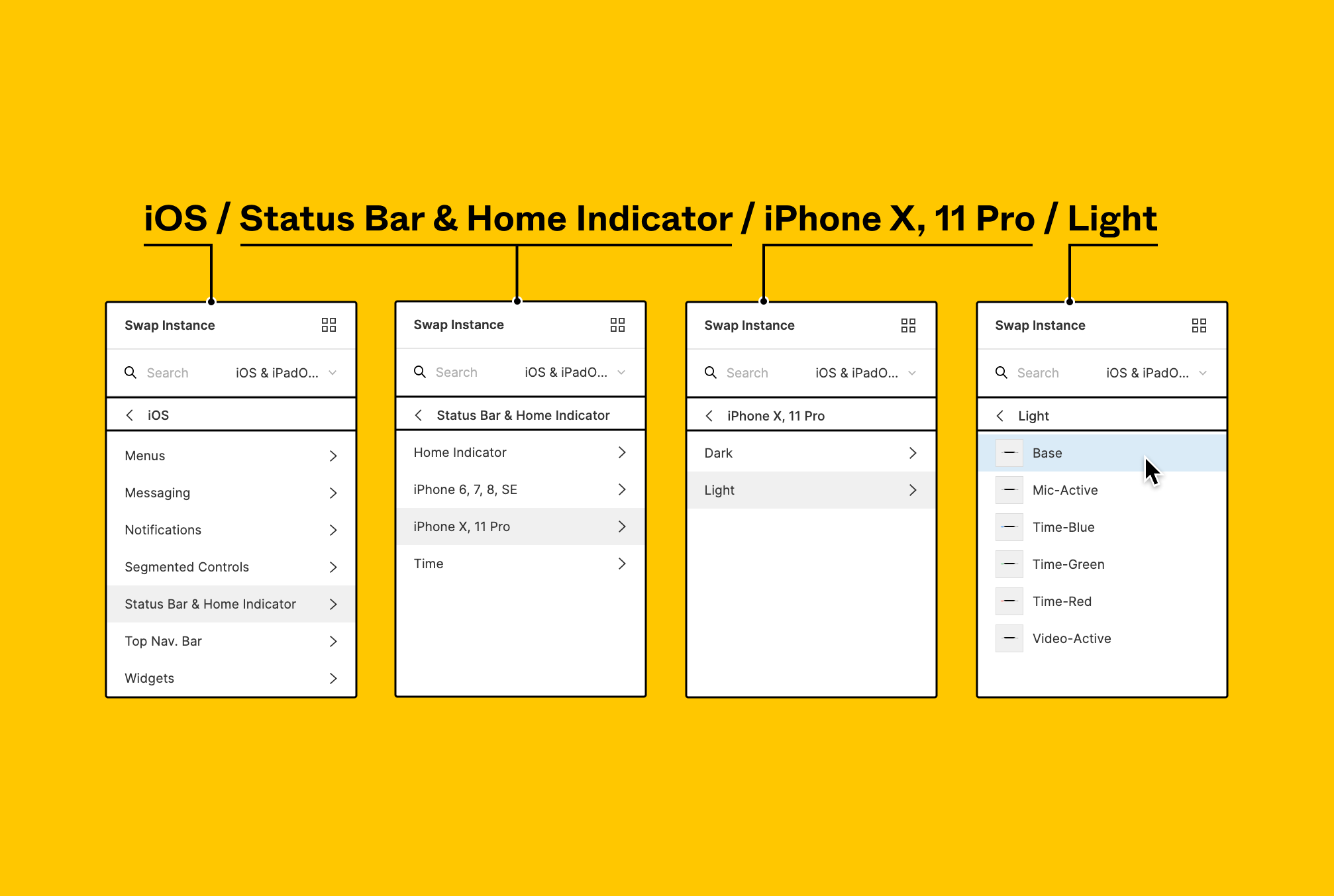
Before variants, the only way we could organize Figma components was using forward slashes or frames to group and nest them together. This was fine, but it wasn't great. It forced us into very rigid folder systems.
Folks often asked, "what's the best way to order groups of components?" Figma's documentation has an example with the following hierarchy: <span class="inline-code">Operating system / Component name / Device / Color theme</span>. But are there advantages to that particular order? Would it make a difference if it was flipped and “Color theme” came first? I always felt like slash-naming was important to keeping a file clean and organized, but that the order of the folders I created were arbitrary. Of all the combinations I tried, I was never satisfied with the folder names or folder-order I came up with. Some were too rigid and convoluted, others were too loose to be useful. Finding that happy medium seemed impossible.
In late October of 2020 Figma introduced their variants feature. Not only was it a game changer for the experience of modifying instances in mockups and prototypes, it also gave us a new, even more powerful way to organize components: variants let us flatten the structures that slash naming forced us into. Variants allow all a component's, well, variations, to be accessed in any order. You no longer have to drill through a half dozen groups just to switch to dark mode.
2 years later Figma announced component properties in May of 2022 at Config. This feature was largely in response to “variant explosion”, a term Figmates use to describe enormous variant sets. I definitely authored some sets that were far too big... my worst was probably a button component with over 1,600 variants.
Advanced users were quick to recognize the potential of component props, but felt it was lacking, and even causing confusion for their teams. After receiving this critique, Figma came through with a fast-follow release in the form of an open beta which introduced:
Designers had been asking for a feature like variables well before variants and component properties even hit the scene. At Config 2023 Figma delivered a first version of variables. This the ability for us to not only store number, color, string, and boolean values, but reference a variable within another variable downstream (this is called ‘aliasing’).
While component properties were a direct answer to variant explosion, I see variables as an indirect answer to the same issue. There’s a lot we’ve still leaning on variant properties for that can now be offloaded into variables.
(Writing in progress... More coming soon.i)
<div class=”horizontal-rule”></div>
But variants, component props, and variables haven't made slash naming obsolete. Nor were they meant to! You should use a combination of all these features to organize your components and make them easy to work with. And, as ever, along with all these new features come new questions to answer... like, when should you use variants VS component properties? Are certain components better to separate with slash naming than adding another prop using variants? When do you reach for one method over the other? Are there any circumstances where slash naming still has an edge over variants? And where do variables fit into all of this?
Because this is a long post, here are some anchor links to help you skip to sections you're most interested in:
Always use separate components for:
Always use component properties for:
<a href="#free-variants-separate-component-vs-component-properties-flow-chart" class="button secondary" style="padding:16px,0px; margin:auto; margin-bottom:24px; border-bottom:0px solid;">Jump to free flow chart resource</a>
<a href="/shop/component-tune-up" class="button primary" style="padding:16px,0px; margin:auto; border-bottom:0px solid;">Component tune-up service</a>
E.g. "default", "hover", "active"
Figma had to release variants in order to release their interactive components feature. Variants were were born to handle interactive states like hover and pressing. They work most reliably when the layer structure remains intact across every variant in the set (if you find you’re losing overrides when swapping variants, it could be your layer structure), which will be true in an overwhelming majority of cases when you're dealing with interactive states. These states manifest as changes in color, stroke width, and effects like shadow. Without a doubt, you should always, always, always reach for variants when componentizing interactive states.
Binary states are like a cousin to interactive states. The difference is binary states are, well, binary: you only get 2 options. What they affect must be described in the property name because the toggle switch in the design panel can only communicate “yes/no”, “true/false.” When deciding what to name a property that uses boolean values, think about the most sensible default state. Like Nathan Curtis talked about in his Schema 2022 talk, your instance users might prefer to have all options turned on and then prune away what they don't need. Others may appreciate the opposite, where they start with a very basic composition, and then add to it as needed.
Another nice touch is phrasing your binaries in the affirmative state so you have a match between the property name and the "true” value. Stick with this throughout your library. Here’s some examples:
E.g. <span class="figma-component">◈ Icon / gear</span>, <span class="figma-component">◈ Icon / house</span>, <span class="figma-component">◈ Icon / pencil</span>
Bonnie Kate Wolf wrote a massively helpful piece for DesignSystems.com titled "A complete guide to iconography." You should bookmark this one. There's not a publication date on the article, but I'm pretty confident it was written before Figma introduced their variants feature, because she describes only using slash naming, frames, and pages to organize icon components—despite using the word "variant" four times in the article! I find this kinda funny, it's like she predicted the feature name.
Icons are things that you absolutely want to organize as separate components. I’ve seen folks make one big "icon" component as a variant set. Then they’ll set up a property called "name" and use that as the mechanism for swapping icons. Whether your collection of icons is just a couple dozen, or hundreds or thousands, this is bad practice because:
“But how do I manage icon size?” I used to recommend the icon-wrapper method, but I've updated my approach. I now think it's better to have a "size" variant property on each glyph. I have a separate blog post that gets into why I think that's superior to other ways you might manage various icon sizes.
“What about interactive states?” Yes, this is when you want to deviate and use variants. You could also offer an “interactive” and “static” version of the same icon so consumers who don’t need or want interactivity don’t have to remove that prototype connection. Molly Hellmuth also endorses this approach.
“What about icon fonts?” I don’t like using icon fonts for many of the same reasons I don’t like to have a single “Icon” component with variants for each unique glyph. You end up having to memorize the exact icon names in the set to be able to get the icon you need. That’s a heavy cognitive load designers need to take on just to use iconography in their designs. What's more is developers prefer SVGs over icon fonts too.
Eventually, engineers are going to reference your Figma components so they can build the product in real life. As much as we can align our Figma components to the structures of the real web, built on HTML, the less translation work we create for our developer colleagues.
HTML tags I try to watch out for include: <span class="inline-code">button</span>, <span class="inline-code">footer</span>, <span class="inline-code">input</span>, and <span class="inline-code">label</span>
E.g. <span class="figma-component">◈ Header</span>, <span class="figma-component">◈ Footer</span>, <span class="figma-component">◈ Button</span>, <span class="figma-component">◈ Card</span>
No one would combine their global navigation and footer as variants in a component named "global elements." They're separate chunks of interface that do different jobs, therefore they ought to be separate components.
If you’re curious why I’m referring to these as “interface representatives” and not just “components”, and what the deal is with the ◈ icon, you’re in luck! I’ve got a blog post all about it.
These components allow you to "edit" an instance's layers without detaching. If you haven't heard about these bad boys, watch Adam Przewoski's youtube tutorial about them. Or check out my other blog post about ✂ placeholders.
Remember, you’re better off not using ⍚ bases in your component libraries! They are better suited for iterating on ideas in local files. And naturally, they’re going to be their own separate components in order to be of any use to you.
Similar to ◈ interface reps, ✂︎ placeholders, and ⍚ bases, ✎ content carriers have to be separate components for you to use them properly.
Starter-kits are curated collections of instances of other components. They're fully intended for to be detached, therefore you want them to be their own components. The frame they come in is a temporary vessel.
E.g. "primary", "secondary", "tertiary"
In the previous version of this blog post, Hierarchy was listed under “things you could use variants OR separate components for.” Now that I have more experience under my belt, I feel confident offering a more opinionated recommendation: handle Hierarchy as a separate component. The argument is that doing so will offer you and your library consumers:
Luis Ouriach has a great thread that covers about these advantages using a <span class=”figma-component”>◈ Banner</span> as an example.
Now, if you’re not convinced on deprecating your hierarchy variant property, or that you shouldn’t make a variable collection named “❖ Button” with modes for hierarchy, at least consider the following:
For folks who are team-variant-property:
Watch Uber’s Maria Hristoforova‘s fantastic presentation from Config 2023 about API tokens. She explains how we can use the same primitive, semantic, and component levels for organizing design tokens and apply that to how we organize properties. You might consider getting more regimented in this area for better alignment with code. This doesn’t solve the issue of discoverability in places like Figma’s asset panel, but it’s an opportunity to get really thoughtful about the words your system uses, and that’s always a great thing to practice.

You also need to be thoughtful about your defaults. You may think it makes most sense to have the <span class=”inline-code”>Primary</span> hierarchy of your <span class=”figma-component”>◈ Button</span> be the default when instances are dropped onto the canvas. But remember, this buries and obscures other options for consumers. Take a look at the production version of your product’s interface (and Figma analytics for instance-insertion) to see which button hierarchies get used the most. It may turn out that <span class=”inline-code”>Primary</span> sees less use than <span class=”inline-code”>Secondary</span>! Remember, the hierarchy level for your <span class=”figma-component”>◈ Button</span> is about guiding users’ actions in the product, not designers’ decisions for what pieces of interface to use. Make it easy for designers to make the best decision decisions, and reduce the work it takes for them to do so.
For folks who are team-variables:
Have a plan to re-educate designers about how to switch hierarchy on instances that use Hierarchy. They’ve probably been used to looking around the properties area of the design panel, or are used to swapping components. You’ll need to re-train their muscle memory to head a bit further south and set the mode when they want to change hierarchy.
E.g. a product card that shows up in many many different contexts.
This is a big one. And like Hierarchy, Major composition changes used to be listed under “things you could use variants OR separate components for.” But I’ve come around. I really think most people, in most cases, should use separate components to manage major composition changes to a component.
What do I mean by “major composition changes”? Imagine you have a product card that displays different information depending on the page its on. The Wirecutter does this with their product cards:

If you proceed to Wirecutter's Deals page, you'll find products are contained within cards and have a lot more information in them! Here we have detailed explanations about why Wirecutter recommends this particular product, along with the article this product is featured in, and a timestamp of when the deal had dropped.

Products also get featured in cards in Wirecutter's articles and guides. This is where the card design gets more complicated: there's a blue banner hanging off the top left, and a small beak on the bottom left. The description in the card is shorter here than on the Deals page because the editorial content is handled by the article. Instead, cards on article pages contain more interactive components like buttons and a bookmark icon. The orientation has changed too; the product image sits to the left of the buttons and description instead of above.

These are all the same component, and there’s a lot of mainstay anatomical pieces such as the product name and image. Because of that you might think it makes sense to make them all variants within a single component named <span class="figma-component">❖ Product card</span> with a property called “on page” with options like “home”, “deals”, and “article”. And you could! But my opinion is that they differ enough in anatomy and visual design I'd probably opt to keep them separate components. I actually decided to build these components out in Figma myself:
Here's a link to the community file for the Figma file above. The blue ribbon on that "article feature" product card was tough to figure out (I made this before Figma released absolute positioning). But it's up and running!
“What about variables?” Well, if I was going to try this... first I’d recommend setting up a collection specific to the component you want to offer major composition changes to. In the case above, it’d be “02 - ❖ Product card.” Again, number of modes will be a big limiting factor. If you need more than 4 compositions, you better be on the enterprise plan. I imagine you’d name your modes the way I mentioned after the context each should be used in: “home”, “deals”, “article.” This is where you might need a lot of boolean variables to show and hide different nested layers. Again, looking at how diverse the layer architecture is for the Wirecutter product cards I built, this could lead you to compromising heavily in this area. Auto layout wrapping can help you a bit with shifting things around, but keep in mind there’s been no mention of variables allowing us to affect auto layout direction.
Ultimately it’s comes down to layer architecture. Variables could be a stronger contender as the feature gets more mature, but right now separate components is the safest decision to default to.
E.g. "filled", "stroke"
Previously I listed this under the section about attributes you could use libraries for. I also referred to it simply as “style”, but only talked about icons. I’ve not been able to come up with other kinds of components that could use style in the way I mean it here, so now I’m going to just own it and explicitly say this is about icon styling.
This may feel very specific, but so was the section about hierarchy!
In Bonnie Kate Wolf‘s article “A complete guide to iconography” she says:
"When you have the same icon with variants, here's how I like to handle them...
Filled vs. stroked: If you are using both styles, use a slash after the icon name to indicate filled or stroked icons."

Note that she wrote this piece before Figma released variants, but I still think her advice is solid. The reasons why are similar to the arguments for managing hierarchy:
Keep in mind that once variables can be applied to inputs like stroke, I may shift this section up into the “Always use variables” area. I believe once that happens it will be better to have a “Icon style” collection where you can set up different modes for the same icon... maaaybe.
Component properties’ whole deal is about boosting instance usability. They drastically reduce the number of scenarios where users have to deep-click through the layer tree to make modifications to an instance’s composition. Changes such as:
Some components compositions—their initial layer structures—remain intact. But how those layers are configured can vary greatly. This is where component properties, specifically the swap property, are incredibly helpful.
For example: a <span class="figma-component">❖ Star rating</span> component will likely always have 5 stars present, but the stars that are "full", "half full", and "empty" depends on the data the designer wants to present. A swap property helps keep the main component's layer count low, and can show her the exact star icon components she needs (no need to go hunting through the library or a sea of icons).
Another great example: Molly Hellmuth encourages folks to use private components (rather than a "status" variant property) for status badges in <span class="figma-component">❖ Avatar</span> components. Nathan Curtis would call <span class="figma-component">.Status</span> a subcomponent). A change in status would be a configuration change: swapping from "active" to "inactive" using a component swap property.

And you'll remember that variants are a good fit for this <span class="figma-component">.Status</span> variant set because variants should always be used for binaries. Here we only have two options: active, and inactive. If a third option, like "active with notifications snoozed" was added in, then I would consider handling them as separate components.
E.g. Gmail’s “Default”, “Comfortable”, “Compact” for items in your inbox.
E.g. Gmail’s “Default”, “Comfortable”, “Compact” for items in your inbox.
I want to be clear: when I’m talking about “size” I’m talking about how much space that component occupies. I see some folks use “size” when they really mean breakpoint (which you should also use variables for).
Similarly, “size” also gets confused with “device.” And even if you've got your definitions straight, design system experts like Molly Helmuth recommends using px-value breakpoints rather than device sizes:
So how exactly am I defining “size”?
In my view, size means you’re dealing with the same anatomy and composition, but things like padding values and space-between values can change. Size is anything that increases or decreases the component’s height or width, agnostic of contexts like “device” or “breakpoint.”
I think the reason folks confuse size and breakpoint is because they do tend to overlap... the larger version of your <span class="figma-component">◈ Button</span> on a marketing landing page is likely used at larger breakpoints, and the smaller ones at smaller breakpoints... but that won’t always be the case. A complicated web-app with tables and tons of controls might benefit from using <span class="figma-component">◈ Button</span> at it’s smaller sizes to accommodate a denser interface, despite being used at a larger breakpoint.
Luckily you can override an instance’s mode, so when you nest <span class="figma-component">◈ Button</span> inside of <span class="figma-component">◈ Data table cell</span> you can apply different variables to <span class="figma-component">◈ Button</span> that tighten up its padding.
Just as when using variants was the best practice for managing a thing’s “size”, variables allow us to be opinionated within our design system. They expose the values the team agreed to use. It makes making good decisions easy, and because they’re overrideable, designers still can deviate and explore new possibilities.
E.g. "default", "success", "error", “warning”
Like with Size, this is where component-level variable collections shine. Keep this collection separate from your other component-level variable collections because not every component in your library need “validation” or “feedback” modes. This will primarily be used for things like form inputs, alerts, and message banners. I would naming this collection “02 Validation component styling”
I recommend naming the first level of groups within this collection after individual components like “❖ Text area” and “❖ Input”. Remember, modes are global within a collection but groups can contain varying and amounts and types of variables. Within a group like “❖ Text area” you may want the following variables (🎨 = color variable):
Then you’d want to set up your modes: default, success, warning, and error. If you’re wondering “how do I account for dark mode!?”, well, if you established theming at the semantic level, then all you need to do is ensure you’re referencing those variables. But if you’re like my team you have to handle theming at the component level (we need to do this because the way individual colors translate between themes isn’t always consistent), and that won’t work here. This means we need to layer different modes from different collections together. Luckily this is something Figma is working on, and they’re calling it “extended collections.” Luis and Jacob briefly talked about this upcoming feature in the “what’s next?” section of their deep dive. Here’s how Jacob described it about it:
Extended collections is going to be one of our answers for solving multi-product, multi-brand approach for variables [...] What we want to do is let you define your base color system, where you have things like “default-bg”, “default-text”, “brand-bg”, and “brand-text.” Then you’d create another collection that’s an extension of the first. You can override variables only to the ones you want to, like “brand-bg” or “brand-text.” [...] This is what allows you to switch between one brand or another.
Handling validation with modes is a big performance win. It can potentially reduce the size of variant sets by 4x! That’s colossal savings for consumers, and from the management end of things.
E.g. “1440px and above”, “756px to 1439px”, “755px and below”
I used to couple breakpoint and device, but no more. These are separate things. Breakpoint is all about enhancing component responsiveness at different viewport widths. And if I'm being honest, it's not just about viewport... the folks at ZeroHeight put out a great blog post where they suggest developing a strategy for how you handle responsiveness. Using auto layout on your components and in your mockups helps immensely between major compositional shifts on a screen. But eventually for larger ◈ interface reps need to also have their compositions altered to fit new spaces. For example, elements that are arranged to sit side-by-side horizontally eventually are so squeezed for space that they need to be arranged in a grid, or vertically:

You should absolutely be using variables and modes to handle breakpoint. I’d encourage you to set up a dedicated collection called “00 - Breakpoint.” You’ll use 2 variables and as many modes as you need for breakpoint ranges. The variables you make will represent the extreme ends of each range. Here’s an example based on Tailwind’s defaults.
And just as they are named, you’ll apply these variables to the min and max width inputs on all your screens’ top-most frame. This will allow you to squash and stretch the screen within those ranges, and flip between modes to see your designs in a different breakpoint. Now, for this to look at slick as the GIF above, you’ll also need to use auto layout wrapping. But that’s a topic for another blog post.
E.g. "dark mode"
Previously this was couched under “What about libraries?” Originally a good practice was to take advantage of Figma’s library swapping feature for changing the theme. But that only worked if you wanted your entire file’s theme to be swapped... if you needed to see two themes at once in the same file, you were out of luck.
Enter variables.
If you’re doing true dark-mode/light-mode theming, it makes most sense to set up those modes at the semantic collection level. But as I mentioned earlier, if you’re not consistently swapping your colors, moving your theme modes down to the component collection level might make more sense.
A quick note on what I mean by “true” dark-mode: this is different from “zebra stripe” design. I think this style is on it’s way out, but an example would be having high-contrast sections stacked one on top of the other. It’s tempting to call the variation of components that sit within the dark background sections “dark mode”, but that’d be a misnomer. Brad Frost explains this well in his blog post about dark mode VS inverted colors:
What is actual dark mode? <span class="inline-code">prefers-color-scheme</span> is a CSS media feature that listens to a user’s preference for dark or light mode at an operating system or user agent level ... There’s another thing that sometimes gets called “dark mode”, but really means “this component when rendered on a dark background” ... To ensure components work on a dark background, we’ve established a naming convention called <span class="inline-code">inverted</span>.
The question so far as been "when should you use variants, when should you make separate components, and what about component properties, or variables?", and that's all been in the context of a single Figma library file... but there's a fifth thing to throw into the mix: having multiple separate libraries.
E.g. "iPhone" VS "Android", “MacOS” VS “Windows”
This is one that is truly dependent on how you/your team works and what experiences your product offers. Some product organizations have entirely separate teams of designers working on desktop and mobile experiences, and they might maintain separate libraries. Or everyone could be merged together, with all designers expected to mock up, prototype, and spec out experiences across all devices. Netflix's designers warn against structuring your design system on your team structure:
"One trap we should all avoid is coming up with a design system that is shaped around a team, because a team could very well change. Instead a design system should be here to stay." Luca Orio - Schema 2021
Netflix has a presence on a variety of platforms. Its apps need to work on our TVs, on our phones, tablets, and in our browsers. Instead of working out of one big library and handling "device" as a variant property, or even as separate components, they chose (wisely, I think) to handle device at the library level.

Another choice they made that helps keep the Netflix app experience uniform across those three very different devices is underpinning their device-specific libraries with a library called "Foundations." My understanding of their Foundations library is that it feeds components and styles into their device specific libraries. Overrides might get made to those Foundations components to account for device specific needs (text on the TV is likely much bigger than mobile devices), but this is what helps create that cohesive Netflix experience.
<div class="horizontal-rule"></div>
Phew. Okay... so now what? How do you take this stuff and actually apply it? Well, if you have the time, it'll take some practice and experimentation, especially with those fork-in-the-road decisions. I could tell you to bookmark this post, but this is a 16 minute read! I wrote this to provide in-depth explanations about why certain decisions are sure-fire, and what to consider when you're weighing two or more options. This post is not a quick reference by any means. So I made you one! Below you'll find a flowchart built in FigJam to quickly get the same information in a visual format, right inside Figma.
<a id="free-variants-separate-component-vs-component-properties-flow-chart" href="https://alicepackard.ck.page/4bf60e8c15" class="button primary" style="padding:16px,0px; margin:auto; margin-bottom:24px; border-bottom:0px solid;">Free flow chart FigJam file</a>
But what if you don't have time? Well, you could hire me! Your personal file fairy. I'm offering a service where I'll come into your file, clean things up, all while you work on other stuff (or take go for a walk, or take a nap). And I offer an add-on where I give you video demo walkthroughs explaining how I did what I did, and why. That makes it educational and productive.
{{component-tune-up-service}}
Between this blog post, that FigJam file, and my tune-up service, you now have 3 different ways to learn how to not only make quick decisions, but strong, accurate ones. After some practice you'll have all the absolutes memorized, and navigating the "this or that" decisions will get easier each time. Especially if you're working with other designers to talk through what's best for you all as a group. And as you're trying out these strategies, tell me how it's going! I'd love to hear what's working, and even more what doesn't work. I intend to follow the same advice myself, and keep this post updated as my thinking evolves.
If you'd like to be notified of when I publish a new blog post, joining my newsletter is a great way to keep up. My readers enjoy bonus behind-the-scenes insights on every post!
I use my own natural, human intelligence to ideate, write, and edit my blog and newsletter.

