Which is better?
This is actually not the right question to ask.
Jodi Foster's character in True Detective: Night Country insists just how important it is to ask the correct question.
Okay, so if "Which is better, live strokes or flattened filled paths for icon artwork", isn't a worthwhile question, then what is?
Let's figure out a better question by unpacking what exactly is wrong with the initial question:
"Should I use live strokes or flattened paths" puts the two options at odds. It assumes you can only have one or the other, but not both.
"But Alice, having both live strokes and flattened filled paths would be a terrible idea! You'd basically guarantee that you'd lose color overrides when swapping icons. Different architecture... color applied to stroke sometimes, and fill other times. Madness!" This is what I'd imagine a designer would tell me.
That's all mostly correct! But still not entirely true. Or it doesn't have to be. The good news is that we're now closer to the actual issue: preserving color overrides when swapping icons.
And if preserving color overrides on swap is the goal, and you assume the color has to be applied directly to the SVG (whether it's a live stroke or flattened filled path), then you have your answer.
But you're intrigued by the possibility of live paths being a viable option.
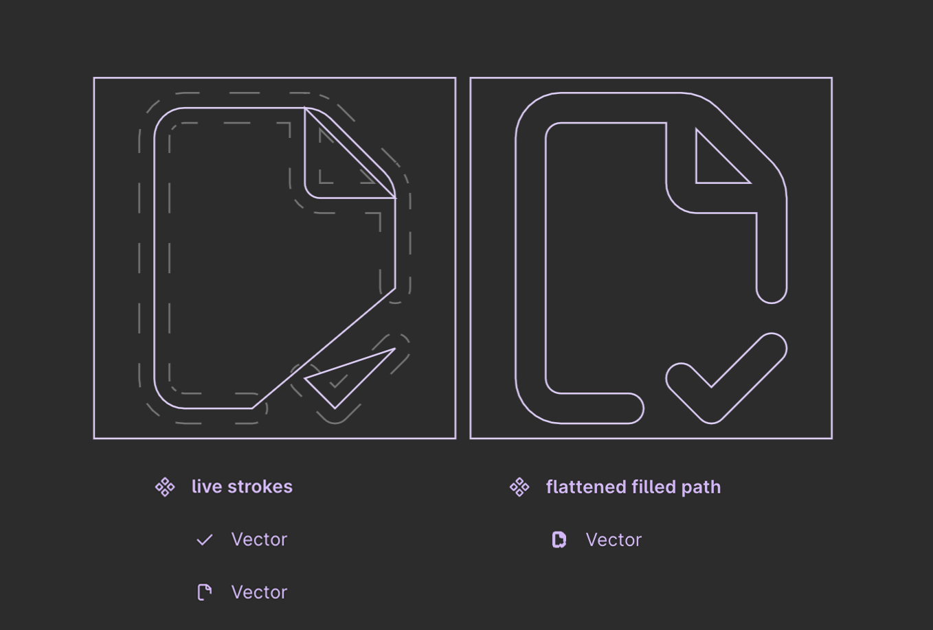
For me, I prefer that live strokes for the fact that they're easier to manipulate. Changing the placement or pitch of the angle of that little checkmark is way easier on the live stroke version than the flattened filled path version.
Now, there's a very valid argument to be made about that situation (editing icon artwork): it's never gonna come up! And this is a common trap that us system-minded folk can easily fall into: future-proofing against scenarios that are extremely unlikely.
"Hang on, Alice, earlier you said something about 'assuming' color had to be applied directly to the SVG... what do you mean?"
What I mean is that the SVG path—as either a live stroke or flattened filled path—can describe WHERE color should show up. But they do not need to be responsible for the overall icon color.
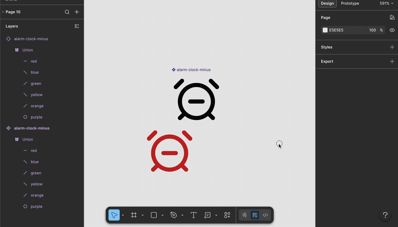
So then does the color get applied? A shape-building boolean operation layer.
Notice how when I grab an instance of that <span class="figma-component">alarm-clock-minus</span> icon and override the color, I'm applying that override to the shape-building layer. It doesn't matter at all what colors the individual paths inside have.
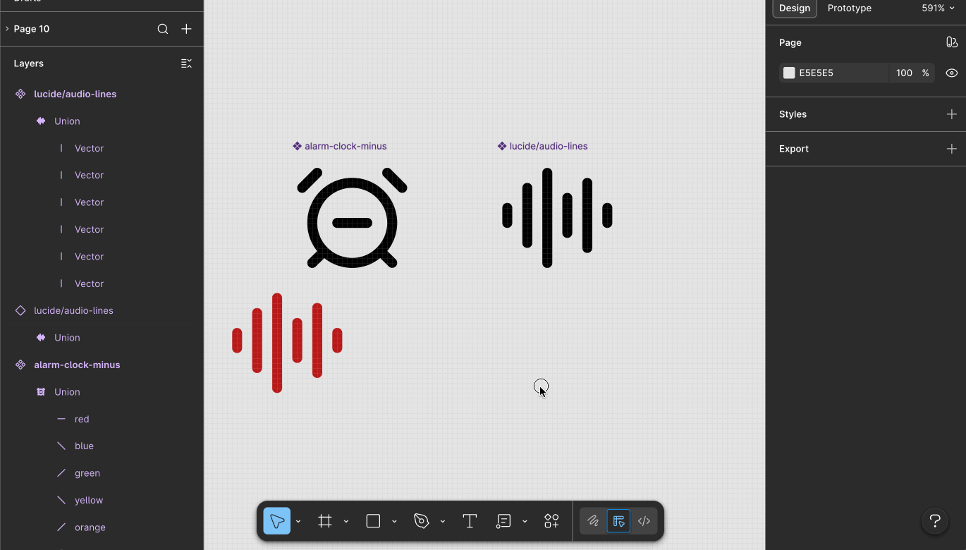
And if you're wondering whether I can swap this out for another icon, and have that color persist...
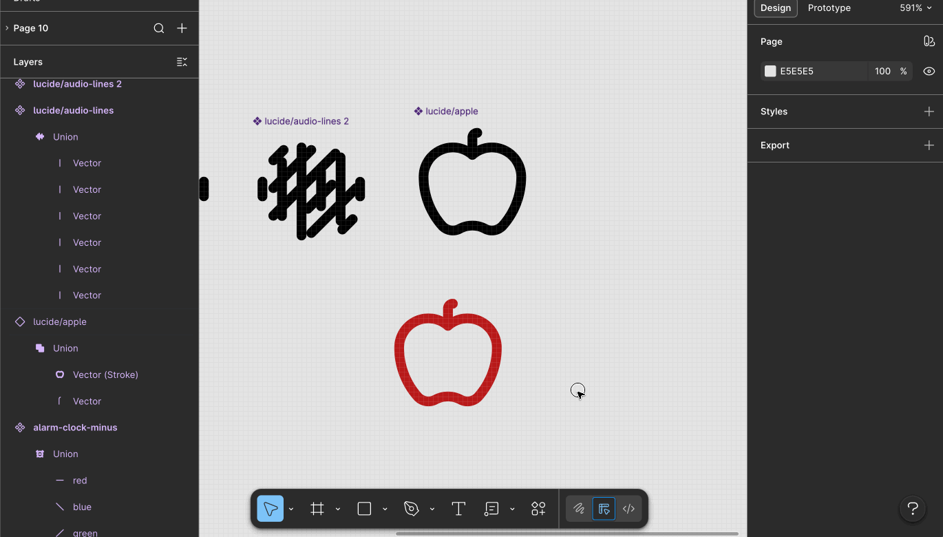
Did you notice that the layer names are different? <span class="figma-component">audio-lines</span> underlying layers were all named "Vector", but the ones in <span class="figma-component">alarm-clock-minus</span> were named "red", "blue", "green", etc. Now that isn't to say layer names aren't important—they are—but not the layers nested inside the shape-building layer. You can name those anything. It's the shape-building layer where naming matters.
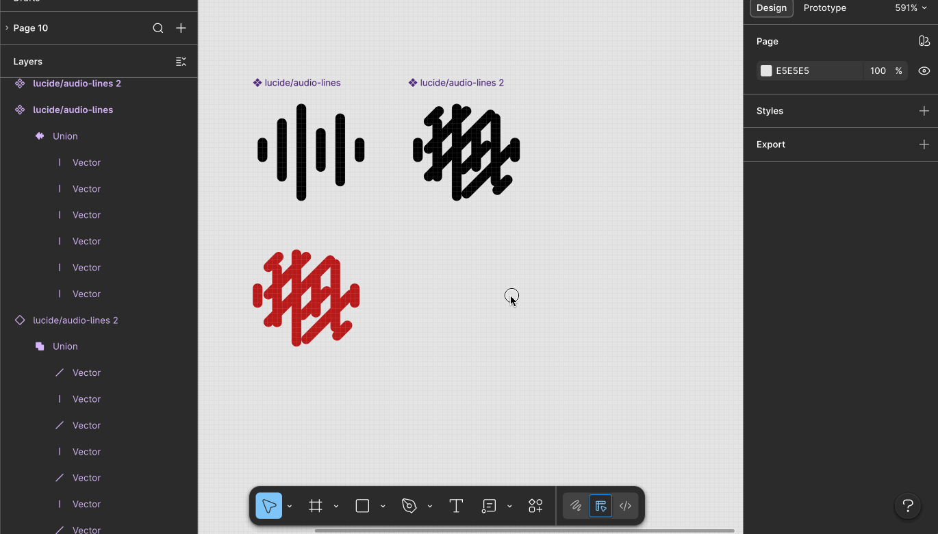
Perhaps the GIF above is still a bit of a "happy path" example, because they each had exactly 6 layers. Let's try this with an icon with many more layers.
And for my final trick, let me show you how putting flattened filled paths and live strokes at odds, and asking which was "better" was the wrong question. In this GIF, I outline the stroke of the body of the apple, but leave the stem as a path with a stroke. They get combined under a union... and my color override persists after swapping.
How about an encore! Just to show you what would happen... these shape building layers are what protect you against the highly unlikely scenario of "what if we need to change all the artwork."
Back to the original question: live strokes, or flattened filled paths? Here's some things to consider:
What's great is you can rest easy knowing that neither method for storing icon artwork puts you at risk for losing color overrides... just wrap them in shape building layers.
If you'd like to be notified of when I publish a new blog post, joining my newsletter is a great way to keep up. My readers enjoy bonus behind-the-scenes insights on every post!
I use my own natural, human intelligence to ideate, write, and edit my blog and newsletter.

