Many design systems want to restrict the number of sizes that icons can be used at. Constraints like this are often helpful, as a closed set of sizes gives consumers confidence their designs are adhering to the system's standards.
Though, not every system has this restriction.
But for the ones that do, I see two popular approaches:
I considered other possible set ups using variable modes and separate components, but quickly dismissed them. I'll explain why before discussing to the two popular approaches above.
This would look like <span class="figma-component">❖ arrow 12px</span>, <span class="figma-component">❖ arrow 16px</span>, <span class="figma-component">❖ arrow 20px</span>.
In some ways, this set up could make some aspects of managing the icon collection easier for a librarian. Namely, making bulk edits to existing icons.
The downside to this approach primarily lies with the consumer experience. Managing icon sizes as separate components makes the asset panel all the more annoying to use.
If you have 100 icons, and offer 3 sizes, that's 300 icons to sift through. Yes, consumers will likely search for the glyph they want by name, but unlike button hierarchies, they'll see 3 visually identical copies of the glyph they're looking for every single time.

I've played around with Figma's native "select all matching..." feature, as well as various community plugins. But they all struggled with selecting similar but discrete variants across multiple variant sets.
Removing variants from the equation means bulk selection and manipulation becomes possible (and just barely—I still had to use find and replace to select the icons I wanted in the earlier GIF).
Because this approach makes librarians work easier at the expense of the consumer experience, I consider it non-viable (much like base components).
Picture a variable collection with modes small, default, and large. Then picture a single number variable with values that match each modes name.
That number variable would be applied to the height and width of each icon component. You could even apply it to each icon's minimum and maximum widths if you really wanted to police icon sizing.
For librarians, this approach has similar advantages as the <span class="figma-component">❖ icon wrapper</span> method. It offers a single place to manage icon sizes for every icon in the library.
But is also lets you do some fancier things...
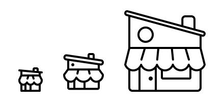
It's not hard to picture boolean variables that show and hide certain parts of the artwork at different sizes. Those small, default, and large modes could be more than just changing dimensions... they can also change the amount of detail displayed.
What's more is you can keep those strokes live and unflattened. If you're worried about preserving color overrides, fear not. I have another blog post addressing that.
Consider the SVG layer for the doorknob. To make sure it doesn't show up on smaller modes, it would need a boolean variable applied to it's visibility that is only "true" in the large size mode.

Notice I didn't name the boolean variable "doorknob". That would be too specific to be useful. Instead, I named the variable according to the situation I want to use it in: "only show this element in this (or these) mode(s)." That way I could reuse it across other icon glyphs too.
On the consumer end, this could seem like an odd way to use variable modes. Typically modes are applied to whole-mockups for theming, rather than individual elements inside the mockup. Some teams might struggle with this approach, others might find it to be an easy adjustment to adopt.
But even if your consumers are cool with this set up, there's a catch: icons aren't the only components with multiple sizes.
You will be tempted to broaden the scope of the "Icon sizes" variable collection to just be "Sizes" so you can control other elements'—like <span class="figma-component">Button</span>—size using modes too.

Look closely at that <span class="inline-code">button-left-padding</span> variable.
Notice that in both "default" and "large" modes it has the same value of 32px. In this example, the system only wants <span class="figma-component">Button</span> to exist at 2 sizes: "small" and "default." We can't leave mode values empty, so the best thing to do for <span class="figma-component">Button</span>'s large mode is to repeat the neighboring value that is "legal". That way if a consumer sets an instance of <span class="figma-component">Button</span> in "large" mode (not allowed), it will look identical to medium (allowed).
Some will want to play devil's advocate... "Alice, you could get around that by having a "button sizes" collection with 2 size modes, and a "loaders sizes" collection with 4 size modes, etc etc."
But that will quickly become untennable when you need to nest icons inside of those elements.
Imagine that nested instances of icons need to remain in small mode when <span class="figma-component">Button</span> is in both small mode or default mode. But in large mode, <span class="figma-component">Button</span>'s icon needs to bump up to default mode.

This is not possible to do when you handle size with modes without component-level variables. And so far, my experience tells me these should be avoided.
The number of variables you'd need, and clever aliasing you'd have to do, would get very hairy, very quickly.
Let's pause again. The point of this infrastructure is to control sizes of various UI elements. That's what we want. But as illustrated above, using modes to handle individual elements sizes does not offer better control than other approaches.
<div class="horizontal-rule"></div>
That covers 2 approaches I do not endorse. Let's move onto 2 that I do recommend.
I first learned about the icon wrapper method from Ridd back when he was sharing Figma tips in the early 2020s. This approach caught on and became quite popular among design system folk and Figma nerds.
What made icon wrappers attractive was they made it easy to manage a closed set of icon sizes—number values—from a single place: an <span class="figma-component">icon wrapper</span> component.
This approach was very much of its era. Base components were also popularized around that same period of time.
Hindsight tells me the popularity of these approaches was borne out of a lack of variables. Back then, the only feature we had for systemizing things were components.
But discussed earlier, variables are not the answer here.
The pain that icon wrappers addressed was about asset management. These components made managing "size" for icons easier.
Adding a new size? Easy. Changing an existing size? Easy. Deprecating a size? Pretty easy.
But in an age where automation and bulk-editing are getting increasingly easier, do icon wrappers still have a place in our library files?
Yes, I think so, but there's more nuance now.
Again, consider building a <span class="figma-component">Button</span>.
If you're a library architect whose library is using <span class="figma-component">icon wrapper</span> to manage icon sizes, you'll nest an instance of it inside of <span class="figma-component">Button</span>.
Why?
Because consistency. <span class="figma-component">icon wrapper</span> is where the system describes what sizes are "allowed" for icons.
So you nest an instance of <span class="figma-component">icon wrapper</span> inside of <span class="figma-component">Button</span>, which itself has 3 sizes (small, medium, and large).
But this is where things become fragile.
To let consumers swap icons, you need to expose the properties on that nested <span class="figma-component">icon wrapper</span> instance. This will reveal both the "size" property" and "icon" property.
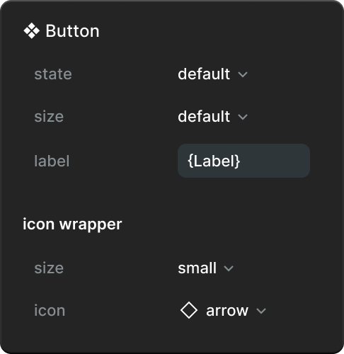
But remember the image from earlier with the teal buttons... the system likely wants icons within <span class="figma-component">Button</span> to use specific sizes. A "large" icon in a "small" <span class="figma-component">Button</span> is not allowed.
There is a popular idea proposed on the community forum to allow component architects to choose individual properties they want to expose. That kind of granularity would resolve this issue. But this seems like a complicated feature to release. Some properties are inter-dependent (see Nathan Curtis' "The Sorry State of States" article). If changing one prop reveals, hides, or changes other props, how would this feature work?
I think it's best to not put our eggs in that basket. Let's focus on what we can control, with existing features.
Pesky "size" property aside, this approach limits the design system from using other quality of life features across icon-having elements. Namely, preferred swaps.
<span class="figma-component">icon wrapper</span>'s "icon" property must offer every icon for it to be useful. This is bad news if the system only wants certain icon glyphs to be used in <span class="figma-component">Button</span>, or any other element using <span class="figma-component">icon wrapper</span>.
Perhaps this is less problematic for <span class="figma-component">Button</span>, but more so for <span class="figma-component">Rich text button</span> that only wants icons like <span class="figma-component">Bold</span>, <span class="figma-component">Align-left</span>, <span class="figma-component">Underline</span>, and <span class="figma-component">Paperclip</span>.
I've written at length about how costly variant properties are, but considering aaallll of the above, I believe they're our best bet for managing "size" as a property (icons or otherwise).

Having the "size" property exist on every icon component delivers a better experience to consumers:
But this method comes with a cost.
It is more effort to manage a "size" property across hundreds of icons. Adding a new size, changing an existing one, or removing a size, are all going to be moderately effortful. I tried looking for a reliable plugin, but came up empty.
But I'm hopeful that new technology will make those tasks easier. Folks who are using TJ Pitre / SouthLeft's Figma Console MCP (I am not, as of writing this) may be able to get help writing a script that assists with those tasks. I will try this myself (soon, hopefully). I'll update this post when I learn more.
I also have an idea of using a hidden text layer inside of each icon, and controlling the icon's size by adjusting that text layer's type style..... but again, I need time to play with that. And I'd rather not hold up publishing post. So I'll leave it as a teaser for now. Maybe you'll try it before me! If you do, tell me what you learn. Happy to credit folks in future updates to this post.
If you'd like to be notified of when I publish a new blog post, joining my newsletter is a great way to keep up. My readers enjoy bonus behind-the-scenes insights on every post!
I use my own natural, human intelligence to ideate, write, and edit my blog and newsletter.

