
Rendering an icon into Figma using a text layer takes a lot of work.
Figma's own docs (which use Font Awesome as an example) describe this as a 7-step process. The worst step involves leaving Figma to go to FA's website... browsing their collection of glyphs, selecting the right one (which opens a modal—ouch)... copying a teeny tiny inline rendering of that icon to your clipboard... and coming back to your text layer in Figma to paste it in. Woof.
It'd be great if FA's official Figma plugin let you copy the font-based glyph to your keyboard to paste into your text layer. That would reduce the context switching and feel a lot faster.
But that's not the case. When you select an icon in FA's plugin, it places it on the canvas as an SVG path inside of a frame.
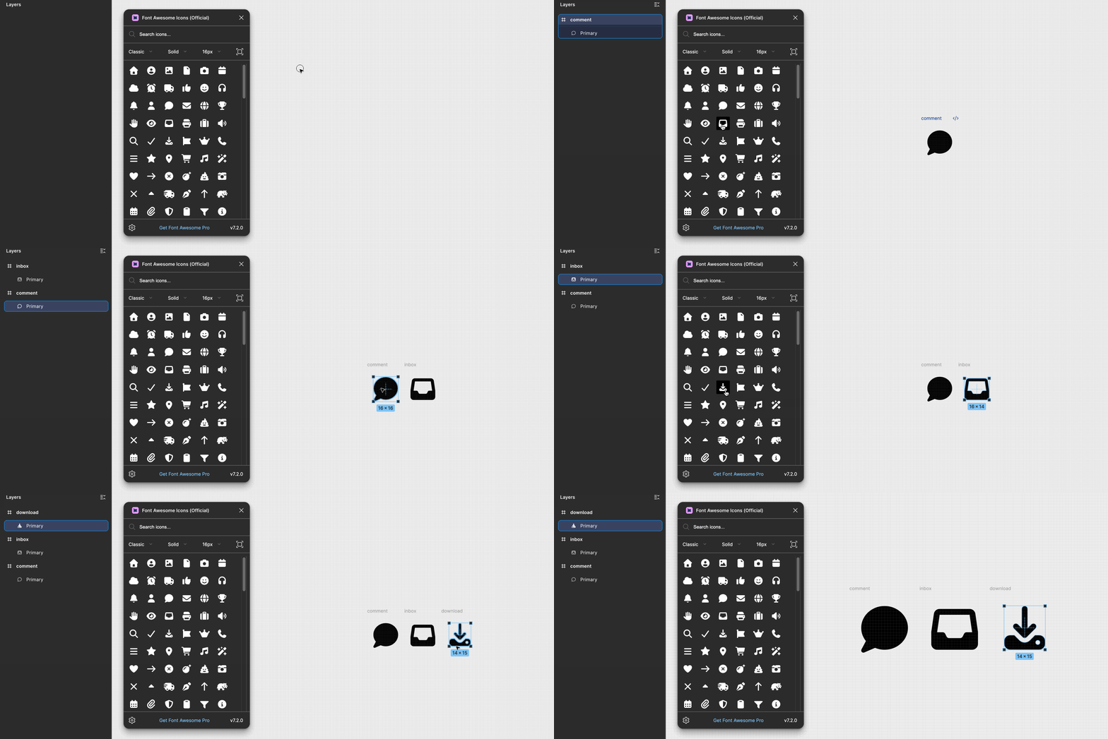
Google's official Material Icons Figma plugin behaves the same way.
If I was working with SVG paths that were stored as components, I could just pull instances directly into my designs.
While I couldn't pull this off with FA-6's free collection, I could with Material's icon font: rendering the icon in my text layer by manually typing the glyph name:
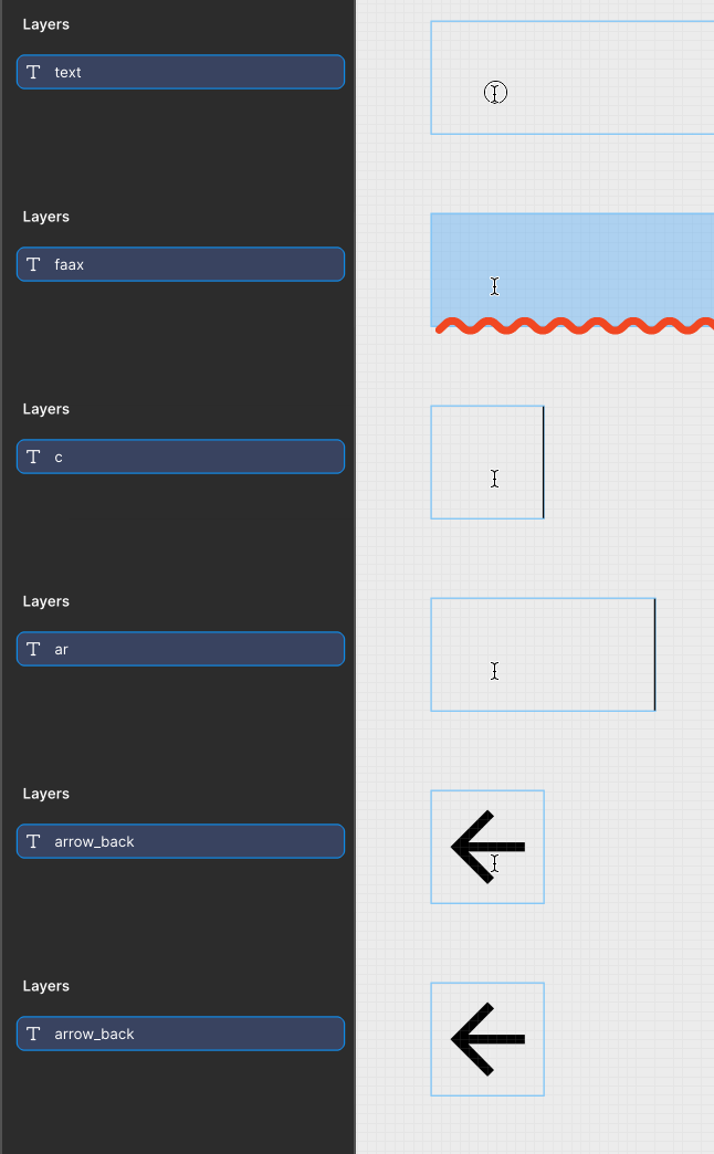
There's something about this workflow that feels faster and more satisfying than the one above. But that doesn't mean it's great. For this to work, I'd have to memorize the exact names of glyphs. When I want a glyph I don't have memorized, I still have to use either the font-creator's plugin, or a gallery on an official website to browse my options and learn new icons' names.
If I was working with SVGs stored as main components, I'd get the visual previews and have "fuzzy search" available via keywords stored in the component descriptions. What's more, those keywords are mine (or my design system's) to control.
I mean, just look at the difference in experience for overriding icons within a component:
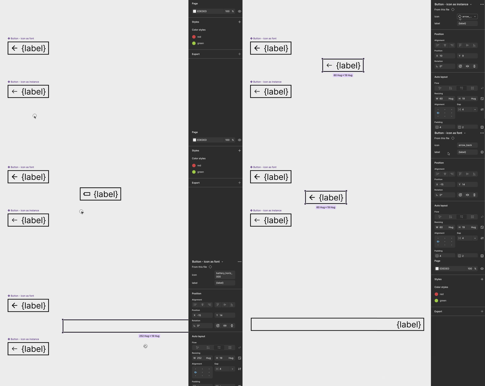
I couldn't be bothered to figure out why typing the exact icon name failed in the example above. The risk of mis-typing something is just too great... subjecting design system consumers to memorizing icon names like this is just plain bad.
A downside I see here is a creativity trap. Because the names must be exact, and because any one person can only be expected to memorize so many exact icon names, the world of possibility shrinks. Depending on your goals as a designer, this can be a big hinderance.
If you're expected to explore, go wide, and produce lots of visual artifacts to compare against each other, this workflow... sucks! It's just as cumbersome as the first one, but you also have to contend with actively-fighting the urge to "just pick an icon you've already memorized the name of" because that's faster and has less friction than going out to source a new glyph.
To truly get two or more glyphs to sit side-by-side, you have to render them in Figma. In this example, I'm interested in comparing Material's <span class="inline-code">arrow_back_2</span> with <span class="inline-code">arrow_left</span>. Filtering their gallery by the word "arrow" still pulls up other relevant results around and between these glyphs.
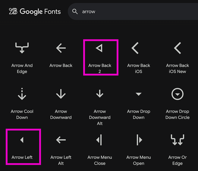
Spatially, they're too far apart to adequately compare them. To do that, I'd have to render these in Figma.
Comparing this to SVGs stored as main components, I'd say the same thing I did in the first point: I could simply pull instances directly onto the canvas to compare them.
Have you ever made a font? And I mean really making a font... like, pulling on handles and creating curves. You'd do this in software like FontLab, or FontForge.
If your icons exist as a font, you might use that software to edit your icons. And font-editing tools will absolutely have a learning curve to them.
But maybe that's overkill.
Perhaps you'd rather edit the paths in a tool like Illustrator or Figma, export the SVGs, and then generate your icon font using something like FontCustom or Fontello. But even FontCustom's README file suggests... not using an icon font at all!
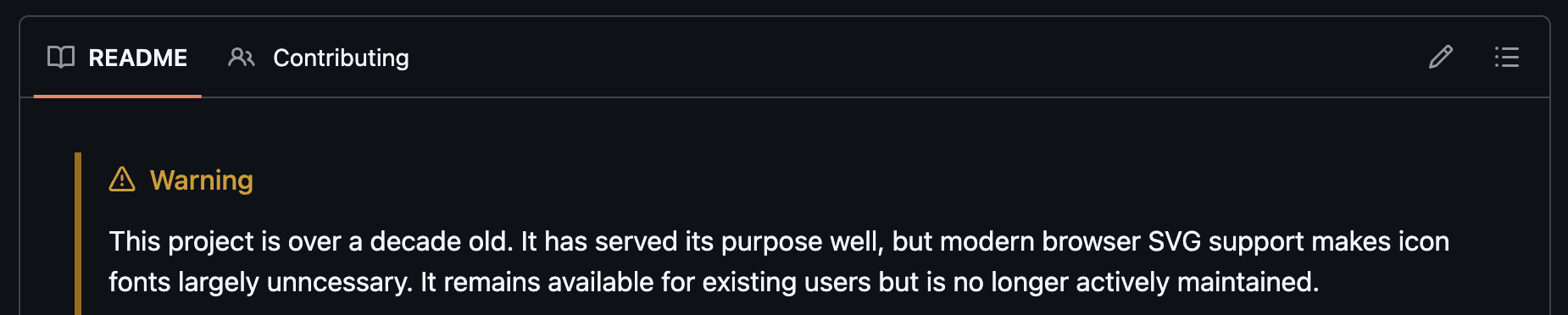
And this includes adding new icons to the set. It happens! Even when you're using a popular collection with over a thousand icons, eventually the need for something custom will arise.
Adding that custom glyph is a lot easier to do when everything is managed in Figma as main components.
Once you've got things installed, you're fine. But it never lasts forever because... we live in a society! You're going to change jobs. You'll have to re-install the font on your new work machine. Or, a new colleague will join your team. They'll ask, "hey, can someone get me the font file?" This is assuming you're using an icon font that's not free and already available via google fonts.
If you're lucky to be on Figma's organization plan, you can install the fonts within Figma and folks don't have to fiddle with installing anything. But you might not have permissions to do that. In that case, it's up to whoever is managing your company's Figma account to do this—let's hope they do!
But when your icons are stored as main components, designers have a lot more control over how those assets get shared among teams.
Developers can achieve this outside of Figma, but inside Figma, it's not an option. If you're using an icon font with a duotone "weight" option, you can get duotone icon fonts in Figma, but not multi-color.
How does one achieve multi-color icon artwork in Figma? SVG paths stored as main components, of course, but how do you contend with color overrides? I've written about that in another blog post.
And it seems like most don't. They haven't for a while. This CSS tricks post from 2014 offers a lot of good reasons to use SVGs instead.
This post I've written is the Figma-version of that post, I suppose!
<div class="horizontal-rule"></div>
My argument is that in Figma, it is better for icons to be stored as SVG paths, within individual main component frames, rather than rendering icons in text layers using an icon font.
The one big advantage icon fonts in Figma have over component instances is the ability to be placed in-line with other font families:

However, this text layer isn't very design system friendly. It's a mix of two font families on the same layer: Inter and Material icons.

That means you can't connect to variables, or text styles. My hope is one day Figma will introduce <span class="inline-code">span</span>, or something like it (one of my wish-list items).
Even though icons as component instances can't do that nice in-line text-wrapping behavior, I think the pros far outweigh the cons. There's still, of course, questions that come with my preferred approach: "How do I manage different icon sizes?" and "should I flatten my SVG paths into a single layer?"
Good news, I've written about both of those topics (managing icon size, and outline VS stroke artwork).
If you'd like to be notified of when I publish a new blog post, joining my newsletter is a great way to keep up. My readers enjoy bonus behind-the-scenes insights on every post!
I use my own natural, human intelligence to ideate, write, and edit my blog and newsletter.

