The icon component "best practice" we've all been following is a lie
That best practice typically goes like this:
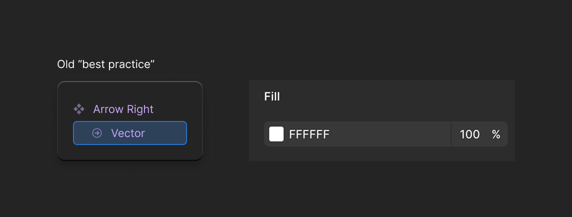
Icon components have to be built like this: 1) outline all strokes 2) flatten everything into a single layer 3) name it something like "Vector"
Says who?
Like... everyone:
examples of many such cases
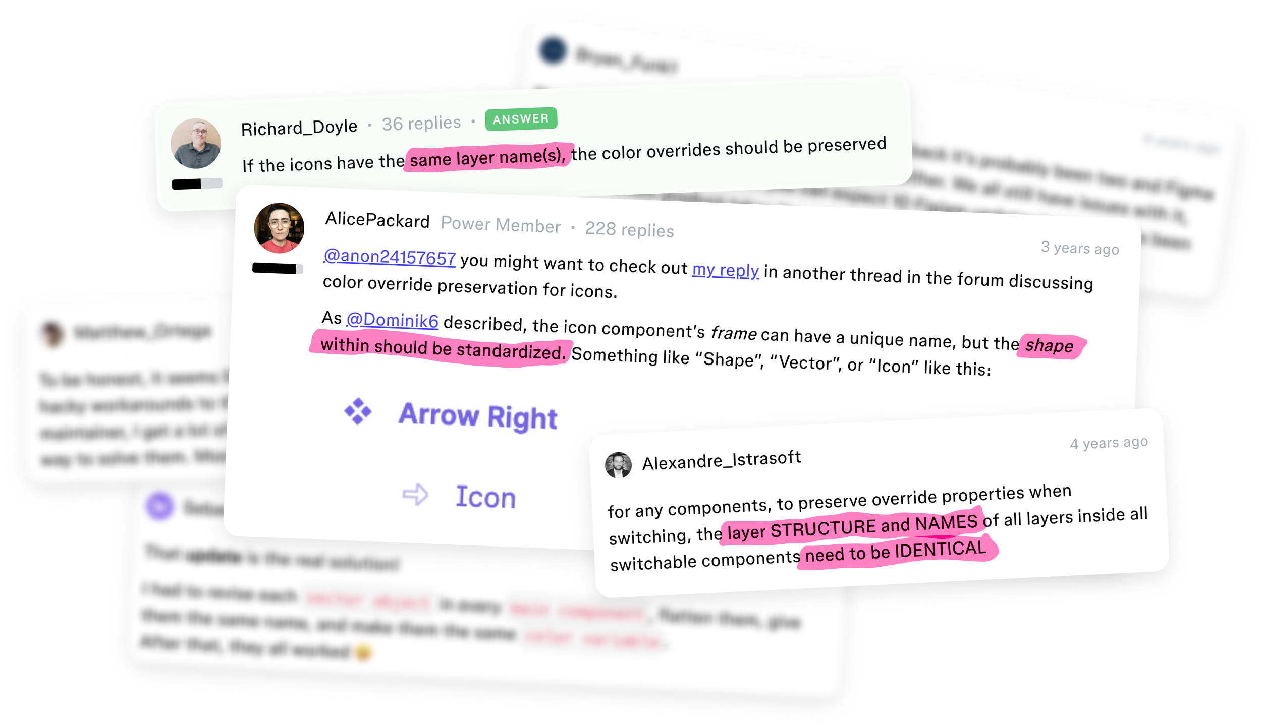
For years we've been telling each other this is the only way to prevent icon component instances from losing color overrides when swapping between icons.
And it's true that it preserves color overrides...
But it is NOT the only way.
And it's far from the best.
What if you could have <span style="color: #FF1892;">infinitely flexible</span> icons and <span style=" color: #FF1892;">permanently protect</span> color overrides?
When I say, "infinitely flexible" I mean it. Imagine icons that are,
Impervious to rebrands. You could switch from Material icons to Lucide—like, physically swap out the SVG path layer—and color overrides on instances are complete unaffected.
Editable. Want to tweak an icon's artwork? Or make a brand new, custom icon by Frakenstein-ing bits and pieces of other ones together? Great! In this world, your icons can have as many layers as they need. No outlining and flattening. Artwork can remain flexible, making them easy to riff on and build upon.
Systematized. Imagining componentizing parts of artwork to use across your library. Perhaps the angle of the checkmarks is too obtuse, you want to tighten all of them up: <span class="figma-component">❖ user-check</span>, <span class="figma-component">❖ server-check</span>, <span class="figma-component">❖ circle-check</span>, <span class="figma-component">❖ clipboard-check</span>, <span class="figma-component">❖ cloud-check</span>, <span class="figma-component">❖ double-check</span>, <span class="figma-component">❖ save-check</span>... if the <span class="figma-component">❖ checkmark</span> itself is a component... you can systematically update icon artwork!
Multi-color, multi-opacity, multi-ANYTHING. Icons that use both a neutral color AND a brand color from your design system. At the same time. Or part of the icon is semi-opaque, using a number variable to control that value. Or part of the icon uses a gradient, while the other part has a solid color.
Any artwork style you want: filled, line, or mixed. And you could have all three, if you want. All in the same icon.
Naturally primed for animation. If every little shape that makes up an icon gets it's own layer for easy editability, that also lends itself well to being easy to animate.
Super-charge with variable modes. Again, editable artwork layers would mean you can hook up pieces of artwork to variable collections in a way that wasn't possible before.
All of that, and instances' color overrides are safe and sound.
No more asking, "how is this still a problem" in the community forum.
Gone are the days of having to stop everything to "fix the icons... again."
They just work.
And this would unlock so many more ways to express the brand through icons far beyond a single solid color!
How do you have flexible icons with wildly different layer architectures, without putting overrides at risk?
Shape building layers.
No one is gatekeeping this info either.
The FontAwesome team showed folks this method in their talk at Config 2023. I also have not one, but two blog posts about this method.
Even before then, people in the community forum were sharing this method! But it was drowned out by the "best practice".
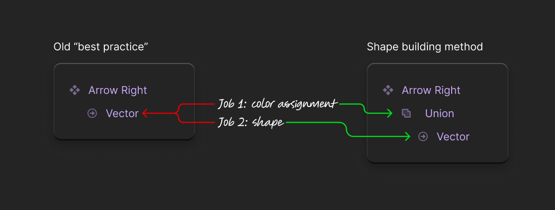
Shape building layers split up two important responsibilities:
Color assignment
Shape
The old method married those jobs into a single layer: the "Vector" layer.
Vector had to both describe the shape of the icon, and what color that icon should be.
Now imagine you're managing the icon components, and you hear that the company is about to undergo a rebrand.
Part of this rebrand means switching from using Material icons to FontAwesome.
Your reaction?
Your icon components already exist, are already in use inside other components, and inside of consumers files... it'd be ideal if you could just change out that "Vector" layer for the FontAwesome equivalent of each Material icon...
But even if you're using to the old "best practice" you're guaranteed to lose your color overrides. Why? Because that new shape will come with a brand new node-ID.
If only there was a way that color could live on its own layer, and that node-ID could be preserved, separate from the SVG layer...
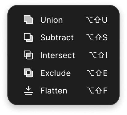
Behold! The shape building method!
Shape building operations split up the two jobs:
One layer is responsible for color, and only color.
Another layer responsible for shape, and only shape.
This separation means that overrides are far better protected, and the artwork gains enormous flexibility.
You can do anything inside of the shape building layers.
So now you know the rough mechanics of this strategy.
But now you have to install it, and publish it... And I won't sugar-coat this: installing this method is a breaking change that will lose color overrides.
A bit ironic, I know.
Publishing a breaking change to every icon takes guts
If you're reading this page, you are not starting a design system from scratch.
You already have something like 1,000+ icon components in Figma.
And instances of them are nested in other componentry: <span class="figma-component">❖ Button</span>, <span class="figma-component">❖ Accordion</span>, <span class="figma-component">❖ Alert</span>, <span class="figma-component">❖ Select</span>, <span class="figma-component">❖ Text Field</span>, <span class="figma-component">❖ Password Field</span>, <span class="figma-component">❖ Modal</span>, and so many more.
So yeah, there's nothing scary about installing a new architecture in icons layers. If anything, you can imagine it's a very boring, rote process (you're right)!
The scary thing, the thing that makes people freeze up, is hitting "publish" on those changes.
Everything downstream of your icons—the design systems' components, consumers' mockups—will have their icon color overrides lost.
You're probably imagining your consumers coming after you with torches and pitchforks...
How do you roll out such a big change without pissing off your entire consumer population?
The answer is unfortunately quite anti-climactic.
You create a communication plan.
Pre-written Slack messages for consumers
Pre-written Figma publication notes
Instructions for yourself when you're in the thick of executing all this work
If you draft things like that in advance, then it just comes down to working the plan.
And that's what this course is all about. Making the plan.
What's in the icon refactor course
This email course will deliver 5 emails over the span of 4 days.
It's designed not just to teach the shape building strategy, but to get you taking action and executing this refactor.
The ultimate goal is to make this the last time you ever deal with color override loss on icons again.
Here's how:
It starts with a deep dive on the shape building strategy. My email course includes a video demo that shows the 6 major benefits of the strategy, in detail.
Throughout the course I'll provide detailed walkthroughs of exactly how me and my team installed the shape building strategy, beat for beat. I'll explain how we automated the installation process, how we handled consuming the breaking change downstream, and how we communicated that breaking change to consumers. By seeing exactly how we did things, you'll be able to fine-tune your approach. Everyone loves to be an armchair-quarterback. Hearing the nitty-gritty of how my team ran this gives you the opportunity to riff and improve on what we did.
All of that comes with a checklist of what you need to pull off this refactor. It's organized to keep minimum requirements separate from nice-to-haves. You'll find that there will be many tempting opportunities to get off track and start playing with fancy tools instead of executing the refactor. This list will keep you grounded and focused in meeting the minimum requirements before you start adding gravy.
Things you'll gain by completing this course
Practice meaningful workflow automation. Conducting this refactor requires automating some work. If you have a manager or are applying to jobs that need you to demonstrate "this person can automate stuff", but you've been struggling to find something meaningful to automate, this course is perfect for you. You won't be simply following my "recipe." You'll be crafting your own unique automation specific to your set up. This is something you can and should talk about in a performance review, on your resume, and in job interiews.
One time payment for infinite value. Once you're comfortable with the shape-building method and refactoring icon libraries, you can "sell" this these methods and workflows to all the future teams and clients you work with. A single, one-time payment gets you access to the course. The knowledge you gain from it lasts forever!
Unlocked capabilities for your icon
Let you brand/creative team go hog wild with ideas. This is good for morale (blog post)
Switch to another icon library without issue.
Lower the barrier for making custom icons. Yes hiring experts is good but also sometimes you just need something basic to tide you over.
Icon artwork that dynamically gets simpler and more complex depending on what size it's at.
Multi-brand system friendly. One icon, multiple styles of artwork, for diff brands. If brand-A wants Material and brand-B wants Lucide—great. They can use the same "arrow-left" component, no problem.
There's probably some insane shader stuff I haven't even thought of.
Each icon component could have a duplication of it as a supporting subcomponent. Folder-animation-1, Folder-animation-2. Those nest in the Folder icon component. If an icon button wants to use animation 1—boom, it's in there.